In this article we will tell you:
- Poster as art as well as advertising and political tool
- 14 cool tips for creating a poster: from idea to printing
- 4 Simple Graphic Editors to Create a Poster
A poster is a small poster for personal use: a birthday gift, part of interior decor, or a serious advertising, informational, propaganda tool. The rules for its creation and design development are universal.
Another thing is that creating a poster for a serious event or a large marketing campaign in some online application is a very troublesome and thankless task. In this case, all the work should be entrusted to the printing industry, where a team of professionals works: from designers to layout designers. Read our material on how to create a poster.
Rules for poster design
The poster can be ordered from a printing company, advertising design bureau, created independently online using a design service, Photoshop, Gravit Designer, Vectr, Photo Pos Pro, Paint.NET, Paint 3D or similar programs, or simply drawn by hand. In any case, for a poster to work: to attract attention, to encourage the purchase of a product or service, to advertise a company, to help in training, to originally complement the design of a party hall, etc. - its design must meet a number of criteria.
11 rules for an effective poster:
Rule one. Compliance of text blocks (main and additional headings), as well as artistic design and design style with the theme, idea and purpose of the poster.
For example, a poster with information about a scientific conference or other official event is best done in a business style, discreet colors and discreet design.
Advertising, concert, holiday and greeting posters, on the contrary, should be designed brightly, catchily, creatively, and sometimes with humor.
Rule two. Informative, concise, interesting, attention-grabbing and easy to read text message. The text of the poster must be carefully edited: make sure that it is concise, clear and easy to understand, correct errors, get rid of unnecessary and insignificant words, and unsuccessful phrases.
Rule three. The key information contained in the poster should be read and remembered first. That is, the most important text block of the first level (the main heading) is typed in the largest font. More detailed information and details are included in text blocks of the second and third levels (additional headings, or subheadings). Smaller font sizes are used for them.
Rule four. One poster contains no more than two types of fonts that combine in style. When choosing a font, it is important to remember: the size and style of letters and numbers should not be discordant with the format and theme of the poster. It is worth considering that beautiful, but overly pretentious, decorative fonts can actually turn out to be illegible and tiresome for the eyes when read at a distance.
Rule five. Fonts should be visible and clearly visible from afar. To do this, it is important to choose the optimal line and letter spacing. Words, lines and headings of different levels should not merge into a continuous canvas on the poster. Otherwise, it will be difficult to read what is written.
Rule six. Images, backgrounds, frames and other visual elements of the poster should also correspond to the theme and complement the text block. They are selected and placed on the sheet in such a way that the text remains visible and easy to read. Some posters (in particular, diagrammatic posters, posters for visual education in school and kindergarten) may contain only images. Others (for example, educational posters-tables, posters-instructions, diagrams, etc.) may consist only of text blocks.
Rule seven. The sharper the text and images contrast with the background, the more noticeable the poster. As you add elements to your poster, it is important to ensure that contrast is maintained and that letters, numbers and pictures remain easily visible from a distance.
Rule eight. The most important text elements should be placed at the top and right, and illustrations should be placed primarily on the left. This makes information read and remembered easier and better. This rule is associated with the peculiarities of our brain’s perception of verbal (verbal) and non-verbal (visual) images.
Rule nine. All elements of a proper poster must be made in a harmonious color scheme. It is advisable not to combine the colors of warm and cold palettes in one poster. If you know where the poster will be placed, it is better to select the shades of the background, symbols and images in accordance with the design of the room. Graphic designers use special color wheels and palettes to find optimal color combinations.
Rule ten. When designing a poster, regardless of its purpose and theme, it is important to observe moderation. Ideally, it is only an expressive contrasting background, laconic (at the same time maximally informative) text elements and images that harmoniously complement them.
Rule eleven. You should not try to fill the entire space of the sheet. The poster can end up cluttered with details, tiring to the eye and difficult to read. When planning the arrangement of elements, it is worthwhile, as designers say, to “leave some air” - to provide areas of free space. This is one of the effective ways to increase the effectiveness of a poster.
The main stages of creating a poster:
- Stage 1. Determine the theme, purpose and style of the poster design.
- Stage 2. Writing headings and text blocks. Editing. Selecting suitable fonts.
- Stage 3. Search for poster design ideas. Selecting backgrounds and images. Choosing a harmonious palette of colors and shades.
- Stage 4. Creating a rough poster layout in a graphics editor. If the poster is drawn by hand, create a pencil sketch on paper.
- Stage 5. Making edits, adjusting combinations of font colors and images, line and letter spacing.
- Stage 6. Printing a test sample.
- Stage 7. Creating a final version of the poster.
Of course, strict adherence to all rules applies only to professional posters, advertising and educational posters. By creating interior, holiday and greeting posters yourself, you can deviate from the standards and give free rein to creative ideas and creativity. However, we still recommend taking into account some principles of composition, harmonious and contrasting color combinations.
Advantages of the StenGazeta.pro service
In addition to the simple interface, the service has a number of other advantages. To get started, you don’t need to download and install anything on your PC, thereby further saving your personal time. All stages of creating a wall newspaper are absolutely free, including the final download of the finished template. There is no limit to the number of posters you can make in the online editor - make as many posters as you need. Anyone who has ever dreamed of making a beautiful wall newspaper for a friend’s birthday, but didn’t know where to start, should test the service. Feel like a real designer with the free program StenGazeta.pro!
About creating a wall newspaper or poster online
Description of the free program interface
Pictures for poster design, photos
Original background images for posters of various topics:
Wall newspapers for the New Year: what to hang on the wall in an educational institution
School, college, institute - everywhere students will be pleased to admire the bright, cheerful posters for the New Year. Even if a student pretends not to notice such art, this is not the case: on the contrary, interest in other people’s creativity appears, and who knows, maybe next year there will be more wall newspapers? Schoolchildren are even more willing to get involved in the work; you just need to help them select content, images and suggest successful ways to implement their ideas.
Selecting images and content
A wide range of images is suitable for children of different ages. If teenagers aged 13-14 pretend that Santa Claus is something completely childish, and they are already adults, then students joyfully draw not only the Snow Maiden, but also give names to all the deer on the poster.
Colorful posters are pleasing to the eye from afar
And the students who drew this poster have already graduated from college and become specialists, and the wall newspaper still circulates across the Internet and suggests what content should be placed on whatman paper. Everything has its own part: here is a series of holidays, a small winter calendar, and a humorous test
If you make a poster especially beautiful, it will not get lost among others.
Before diving into the work, it is worth inviting students to share ideas. Probably someone will have an original proposal
Who said that a wall newspaper must be created on whatman paper? What about creativity?
Those who love the creative process can turn any drawing into a work of art. If there are capable artists among the students, then it is better to entrust the work to them
A prefabricated wall newspaper is assembled from drawings, printed words and images, photographs and applications
If poems and text greetings are used, space is immediately left for this when creating the composition
Related article:
Decoration stencils for windows for the New Year: ways to create New Year's paper stencils for windows, tips for creating stencils for the New Year, templates for New Year's decorations for windows (symbols, Christmas trees, toys, bells, Santa Claus, Snow Maiden, pig, animals, snowmen) – read the publication.
Poster design with flowers, templates, photos
The design of greeting posters often uses decorative backgrounds with flowers, as well as regular or voluminous floral appliqués. With their help, creating a beautiful and colorful congratulation poster yourself is not difficult at all. Just find and download an image suitable for the upcoming celebration online, upload it to a graphics editor, add congratulations, and then print a poster in the desired format. We offer you several interesting template options. Perhaps they will be useful to you in your creativity.
Beautiful templates with flowers for holiday posters:
Stencils for decorative flower arrangements made of foamiran, fabric, paper:
Ideas and tips for a New Year's wall newspaper
There is no limit to creativity, like perfection - you should not treat creating congratulations on paper as a boring chore. The efforts put into the design of the poster and the words chosen from the heart will lift your spirits and create the atmosphere of the upcoming good holiday.
The plot does not have to be taken from the usual cartoons or fairy tales. Or, on the contrary, you can draw on paper characters from different New Year’s stories
Some people prefer to download and print the drawing, while others are interested in arming themselves with paper, scissors, glue and other equipment to create an original wall newspaper
Don’t worry if you have been entrusted with creating New Year’s greetings on paper. Today there are many ways and means for those who do not consider themselves an artist.
Poster design ideas
Poster with photo frames
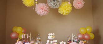
Templates for original greeting posters with photographs are very popular. Buy a ready-made poster or download it online and print it yourself. Paste the best photos of the heroes of the occasion into frames, write congratulations and wishes. Complete the poster with interesting decor. For example, simple or voluminous appliqué, bead patterns, felt figures, paper or fabric flowers, a frame made of inflatable balloons. It all depends on the occasion of the upcoming holiday.
Poster with gifts
A great idea is to use double-sided tape or regular glue to attach miniature chocolate bars, chocolates, sweets, bags of candied fruits, cookies, and nuts to a poster with sincere wishes to the hero of the occasion. Use your imagination: instead of sweets, you can stick on decorative cosmetics, jewelry, small soft toys, stationery... The choice depends on who the original poster with gifts is intended for.
Collage poster
The bright photo collage “Poster of Wishes” will surely impress and delight your loved one. Of course, if you are aware of the plans and innermost dreams of your partner and are sure that the surprise will be appropriate. A beautiful template for such a poster can be downloaded on the Internet or purchased. However, an attractive and appropriate background for a collage poster is easy to choose and prepare yourself.
Volumetric poster
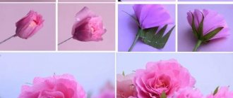
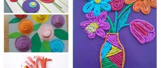
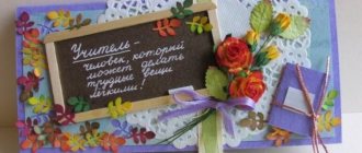
A voluminous applique will help you decorate your holiday poster in an unusual, bright and soulful way. Letters, figures and flowers can be easily made from colored paper, foamiran, felt, fabric, leather, faux fur, polystyrene foam, etc. Even an ordinary store-bought poster with congratulations and pictures will literally be transformed if you get creative!
Air poster
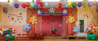
This unusual poster made of multi-colored balloons filled with helium and voluminous foil figures and balloon letters can simply be placed on the wall. But it is better to use a large sheet of whatman paper with a suitable background or a beautiful fabric drapery as a basis. To make the “airy” poster look even more impressive, you can make an arch out of balloons.
Educational poster-mat made of felt
It will be easier for your child to remember letters with numbers, the multiplication table, the names of countries and continents if a beautiful educational poster-mat hangs on the wall of his room. Colorful, voluminous and pleasant to the touch pictures and symbols can be easily cut out of felt and pasted on paper or thick fabric. Such a poster will not only help in learning, but will also decorate the nursery.
Congratulatory photo collage
To create such a gift you need to select as many photographs as possible. To make it easier to decide on the idea of a collage, it is advisable to group them by topic - with friends, with relatives, with colleagues, on vacation.
This poster was created as a gift for a mother who dreams of her own big house.
You will need materials and tools: Whatman paper, pencils, markers, scissors, ruler, photos, postcards, decor.
Work progress
- Whatman paper is laid out on a flat surface. Photos are arranged based on size and theme of the pictures.
Lay out the photo on whatman paper
- Since the birthday girl dreams of her own large home, the center of the composition is made of an image of the house (you can draw it yourself or print the picture on a printer).
Adding decorative details
- The location of photographs on whatman paper is marked with colored pencils. All pictures are removed from the sheet and the background of the poster is created. Small cuts are made at the corners of the contours of the photographs (if you are afraid of cutting the base, you can then paste the pictures on). To create a background, the sheet is painted over with a yellow marker.
Making slots for attaching photos
- All photos are inserted into the slots. Additionally, the poster is decorated with decorative elements cut from magazines and postcards. You can use bows and rhinestones. To fix individual elements, glue and double-sided tape are used.
Gluing decorative parts
If you wish, you can sign each photo with a humorous comment.
An interesting idea for decorating a collage - in the form of drawn puzzles. Moreover, it is not necessary to paste a photo strictly into each cell.
Posters for kindergarten, photo
Is there a voluminous wall newspaper?
Drawing is wonderful, but it’s much more interesting to admire a three-dimensional craft. We connect all our resources and get an excellent result!
Using the origami technique allows you to add volume to the publication. We create drawings not on paper, but from paper, glue the figures and rejoice at this decision
A voluminous tree will immediately create the desired volume and color
We don't know how to draw? No need! We cut out the snowflakes, prepare the best photos, use tape or paper to create a Christmas tree in the center and voila - done!
Thanks to those craftsmen whose works we had the opportunity to admire! Several years have passed since the creation of greeting wall publications, but the memory remains not only for the creators, but also for other people looking for interesting ideas for New Year greetings.
Posters for school, photo
Check poster size
Posters come in a variety of sizes, which vary depending on their end use as well as the country in which they will be hung. A viewer will be looking at a subway poster from a greater distance than at a poster pinned to a bulletin board, so you'll have to adapt the scale of elements in your layout to account for these parameters.
Once you've determined the size of your poster, get into the habit of printing drawings or sections of your design at full size to see if all the elements can be clearly seen from the desired upset.
Educational posters for elementary school
Create a sketch or draft before you move on to development
Posters are an incredibly creative form of design. Their goal is to capture and hold attention. Therefore, it is important to find out the opinions of as many people as possible about the original idea before spending a lot of time and effort on its implementation. First, create a sketch of the future poster, or better yet several, and show it to all your friends and acquaintances. Let them give their honest opinion about the idea.
Child safety posters in the garden, photo
Maintain balance
Posters usually consist of a combination of typography and photographs or illustrated graphics. And between them you need to maintain the balance that will allow you to both capture people’s attention and convey the entire necessary message. For example, on this poster advertising the British BBC television channel, the designers decided to completely divide the space in half, giving equal parts of the poster to each component.
Traffic rules posters for school, photo
Paper gift for defender by February 23
Men also like pleasant surprises. A handmade poster for February 23rd can be taken to school and given to dad and grandpa at home. Typically, such posters depict tanks with red stars, machine guns, military vehicles, airplanes and a soldier with a rifle.
The name of the holiday is written at the top in capital letters. Write a congratulatory text on the side or below.
Sports posters for school, photo
With wishes
An unusual way to congratulate the hero of the day will be group photographs, next to which relatives and friends will leave their wishes.
- To do this, it is better to leave colored pens and markers next to the poster.
- During the celebration, empty seats will be filled with inscriptions that can be read at the end of the evening.
Poster design for anniversary, photo
Print from the comfort of your home
Why waste time printing at a copy center? Photo COLLAGE takes care of the quality of the poster, playbill or wall newspaper. Send the result to your home printer. Select the desired paper size, set the resolution to 300 dpi
and sheet orientation, specify the number of copies, crop markers and margins.
The poster can be saved as an image and published online. This is possible in popular formats: JPEG
,
PNG
,
BMP
,
TGA
,
TIFF
,
GIF
and
PDF
.
share
Flight Express Game
Immerse yourself in the atmosphere of air travel. Under your control, a small plane will turn into an airliner.
All the most beautiful!
Beautiful photos and videos, illustrations, posters. Design, architecture, decor and interior items.
The most interesting!
Travel. Interesting publications, reviews, tips.
All the most useful things!
Useful tips. Ideas and master classes. Useful programs, links, online services.
Mobile applications
For iOS and Android
This is default featured post 5 title
Go to Blogger edit html and find these sentences.Now replace these sentences with your own descriptions.
Microsoft Office Tools
In addition to the above Word, there are at least 3 more applications in the Microsoft Office package that will help solve this problem. Therefore, each will be discussed separately.
Publisher
Initially a tool for compiling printed publications in adequate formats. Main supported: A4 and A3. But there is one nuance that allows you to expand the wall newspaper to the required size.
- Open Publisher from the MO package.
- Open “File” and go to “Create”, where we need to find the specified item.
- In the list of additional sizes, open the “Other” column, where the “Specify manually” item is located.
- Enter the required dimensions.
- The new page size appears in the list of available page types.
Now you can begin to create the desired wall newspaper, which can be assembled using the list of tools from the “Shapes” section on the main page.
Significant disadvantage: Those with less than 4 GB of RAM will have to save every 4-5 actions. Due to the amount of memory allocated for operations, the program will consume enormous amounts of RAM. Even saving the document will take about a minute.
Power Point
This method is only suitable for people who are not satisfied with something in Publisher and Excel. Creating slides as elements of a wall newspaper is not a taboo technique. But you need to have a very clear idea of what the finished publication should look like and eliminate possible gluing errors.
The method has one advantage - ease of printing. The disadvantages are everything that other methods have and a number of their own:
- the inability to change the scale and comprehensively evaluate the product;
- slowness in the operation of individual components;
- Frequent crashes when the page load is high.
Excel
A spreadsheet editor can be a sudden solution. It has the ability to zoom out pages as much as possible and at the same time does not negate the comprehensive viewing of the future wall newspaper. A minimum of knowledge is required to correctly and quickly create a wall newspaper.
Preparation is also minimal and includes:
- In the “View” section, activate “Page Layout”.
- In the same section, return to “Normal” so that page borders appear.
- Combine each page into a separate cell (then you can easily split them).
- Roll back the scale slider and get to work.
This method is convenient because you can see the entire markup in its entirety. But he has a significant problem. When printing, default margins are used and the document shifts and loses its dimensions.
On average, one A4 sheet accounts for 2.5 cm of horizontal and vertical losses. The images are compressed or stretched, losing their appearance.
The second drawback: it is not customary to work with graphics in a spreadsheet editor. In terms of the amount of resources consumed during such work, it breaks all records. Excel starts to slow down after inserting the first high-resolution image. Once the file size reaches 40MB it starts crashing every couple of minutes.
Scribus
Let's talk right away about the advantages of the program:
- Free. Open-source distribution allows you to edit the code to suit your needs, and most importantly, install the program without investing money (if you bought scribus, it’s time to realize that you were scammed).
- Easy. Yes, the package is capable of eating up a huge amount of RAM when processing shadows on the 128th layer of the image. It will probably even crash with an error. But to create a wall newspaper, you don’t need so many layers.
- Easy to edit. As in Corel Draw, each element is a separate block, which can then be removed or changed.
If you don’t need to make wall newspapers on an ongoing basis, then Scribus is the best choice. It is easy to learn and the interface is intuitive. And the full range of possibilities is wider than it seems to the average user.
It is unlikely that the user will have a plotter at hand for printing in A0 format. You can contact a specialized printing center where they work with such large images.
There is, however, a risk of encountering the fact that the document format will not be able to be printed due to the fact that it cannot be opened. Therefore, there is the following obvious and stupid trick.
System Print
This method is far from perfect. It will help save time. First, the wall newspaper is divided into elements (which is why Excel is chosen by many, despite the difficulties), which are printed on A4 sheets without any difficulties at all. Then these sheets are stitched together.
It is best to immediately take into account corrections for margins and similar things. By the way, free Scribus can divide a document into A4 sheets for ease of printing. But it seems like it should have only the bare minimum of functions.
